
From cash handling to payment solutions
Nokas was established in 2001 to provide cash handling for Norway’s banks. After a merger with Avarn Security Group, the brand needed to communicate its new position as a leading supplier of payment solutions. Our mission was to create a new logotype and visual identity that reflects the wider offer to the Nordic market.
- Customer
- Nokas
- Delivery
- Graphic Identity
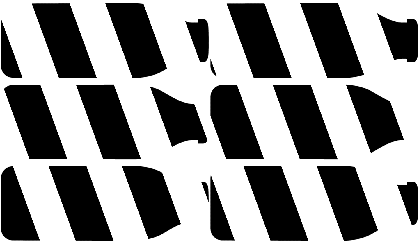
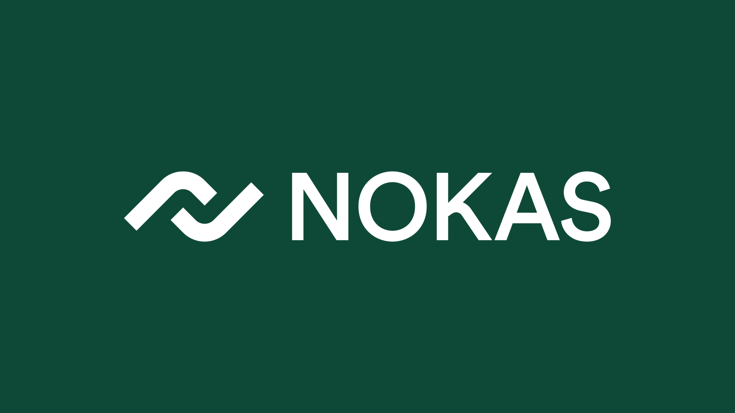
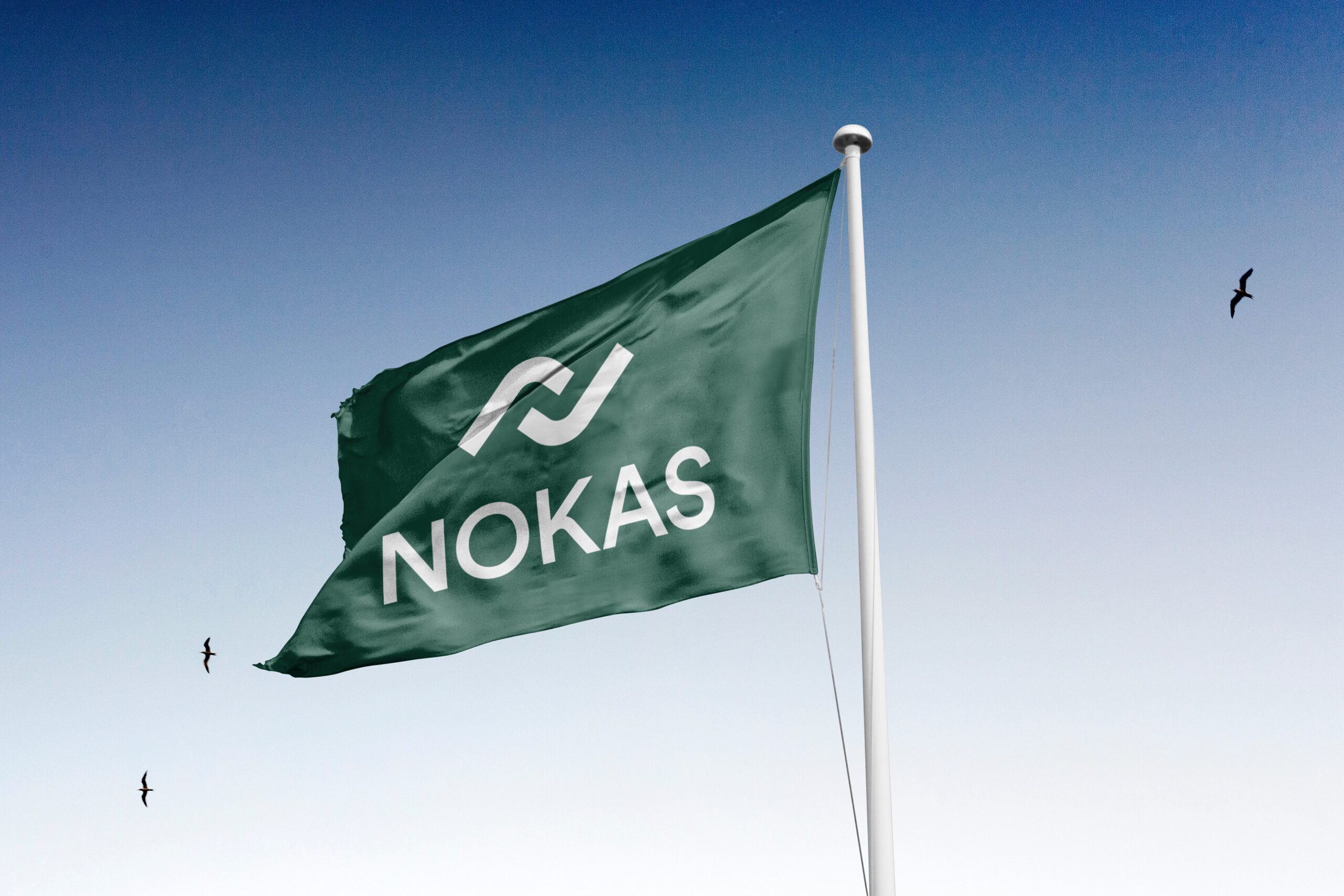
The previous logotype was intimately associated with security services and physical cash handling. Visually, it was also outdated and hard to apply in modern contexts. To retain brand recognition, we created a characteristic word mark that functions as a focal point of the new logotype. The word mark is accompanied by a symbol – a stylized transaction between two hands that illustrates the daily flow of cash and electronic currencies.


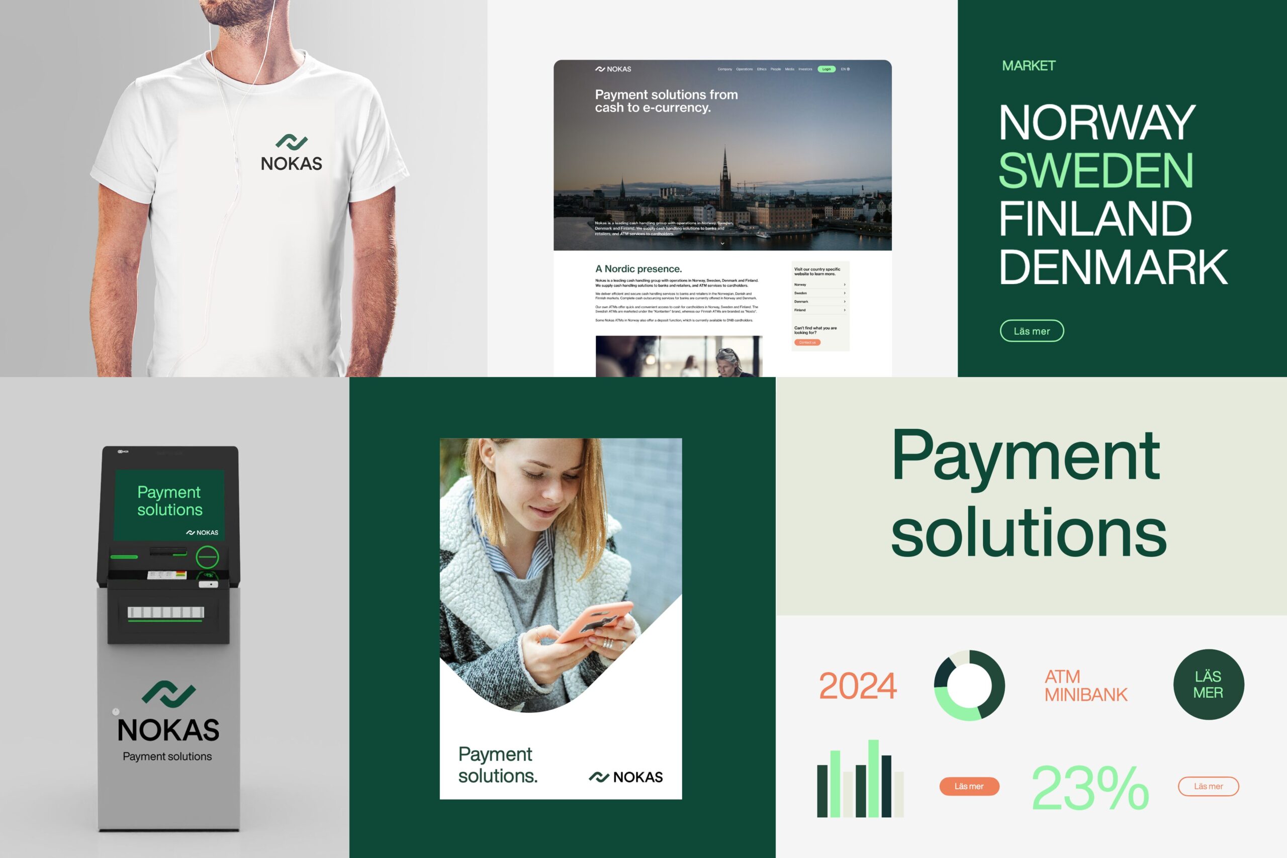
The new identity is designed to give branding, signage and messaging a clear, trustworthy and unified impression. The symbol, visual elements and the main identity carriers in the brand’s color palette – white and Nokas green – can be used to give images, stories and backgrounds a stronger connection to the brand when used in own channels or by B2C-oriented partners. The clean, timeless typography works in all sizes and contexts where the brand meets its audience, from ID badges and ATM menus to buildings and vehicles.

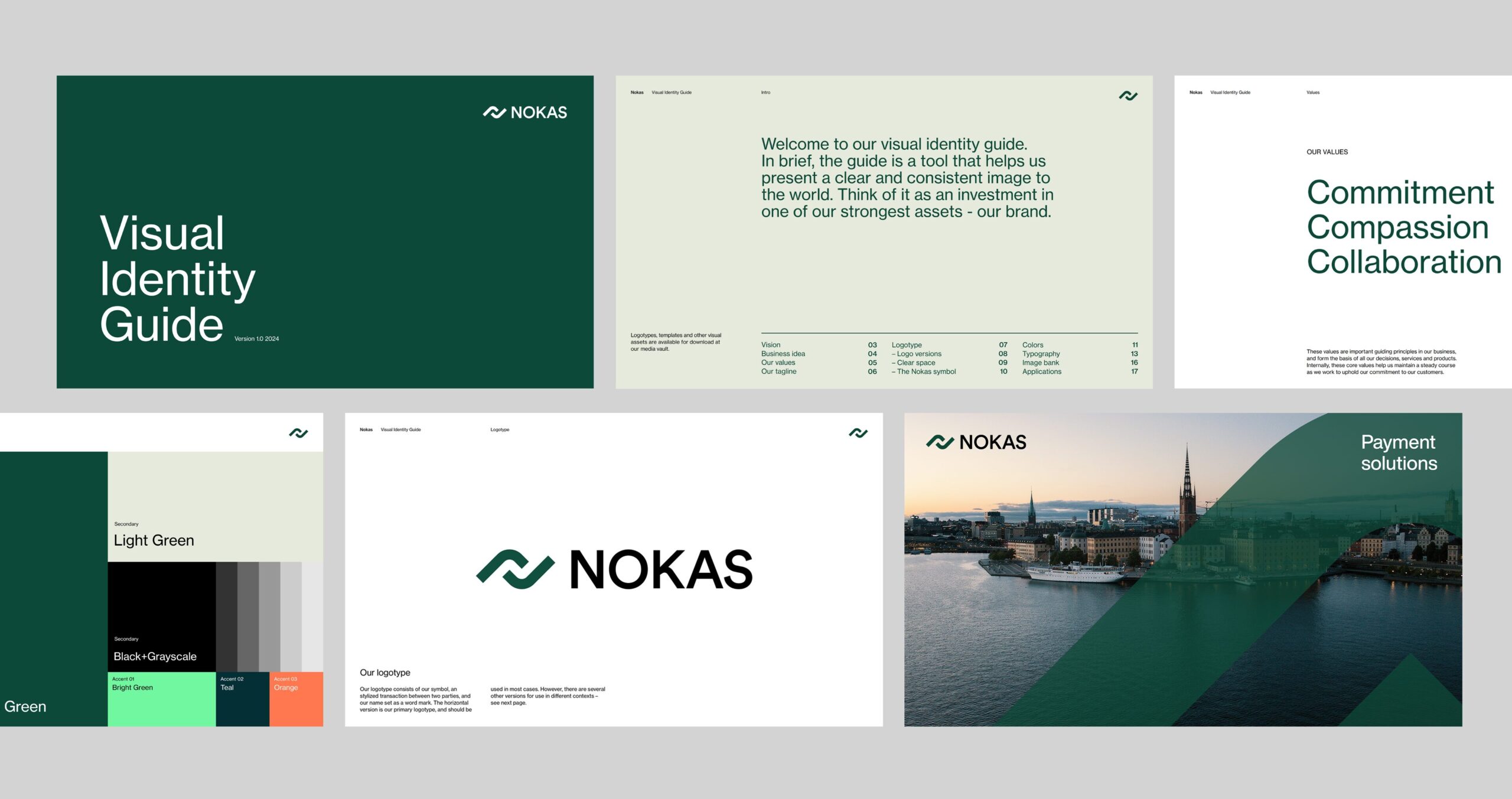
The building blocks of the new identity, guidelines for daily use and the brand’s values are collected in a brand book. The purpose of the Nokas Visual Identity Guide is to ensure that the brand is perceived as a leading supplier of payment solutions across the Nordic countries. Today and in the future.
